UI/UX Design for Mobile

UI/UX Design for Mobile

Design your developers can actually build.

Flows, screens, a clickable prototype and a design system, designed by the team that also builds apps, so nothing gets handed over that cannot be built.

Built by the person you will actually talk to

Anand Yadav, Founder of SightInfusion Infotech

Anand Yadav

Founder, SightInfusion InfotechUpwork Top Rated100% Job Success Score54 client reviews52+ apps shipped

I am Anand Yadav, founder of SightInfusion. I have been building mobile apps for over 7 years and I have personally delivered more than 52 of them: idea, design, development, store submission, the whole thing.

That is why I care about this page more than most. I have been on the other side of a bad handover: beautiful screens, and no answer for what the app does when the list is empty or the network drops. Somebody has to build it afterwards. Usually that was me.

So when we design for you, I am on the call, and I am the one who says whether something can actually be built.

What usually goes wrong

What clients say, and what it actually means

“It looks fine to me.”

What it means

It was tested on one screen, one thumb, one person: the client's.

“Just make it look more premium.”

What it means

Premium is a set of specific decisions, not a mood.

“The designer said it would take two weeks.”

What it means

Two weeks covered the screens, not the states in between them.

What you actually receive

Most design agencies describe the work. Here is the list of things that are yours at the end of it.

DeliverableWhat it is
User flows and structureEvery path through the app, mapped before a screen is drawn
WireframesThe layout of every core screen, agreed before any visual design
Final UI screensiOS and Android, at real device sizes
A clickable prototypeThe whole app, tappable, testable with real users before a line of code
A design systemComponents, colour, type and spacing: the rules, not just the screens
Developer handoff packEvery state, spacing rules, named tokens, assets at every density. See section 7
The source filesYou own the Figma files and everything in them
A walkthrough with your engineersA recorded session so the people building it heard it from us

If any of these is missing at handover, the project is not finished. That is our standard, not an upsell.

Your developers will be able to build it

The most common way a design project fails is not ugly screens. It is a handover the engineers cannot use.

So here is exactly what your developers get:

What they getWhat that means
Every state, not just the happy oneLoading, empty, error, offline, no-permission, first-run
Spacing and sizing rulesWritten down, not guessed from the file
Named tokensColour, type and spacing as values your code can hold
A spec they can read without a paid design-tool seatExported and annotated. Design tools charge per developer. That should not become your problem
Assets at every densityiOS and Android, ready to drop in
A walkthrough call with your engineersBefore the build starts, not after it breaks

Why we can promise this and a design-only studio cannot: our designers sit with our developers. The people who draw it and the people who build it are the same team, on the same projects, every week.

Instant Loan & Lending App for iOS & Android
Fintech & Lending·Fintech·hindustanloans.com↗

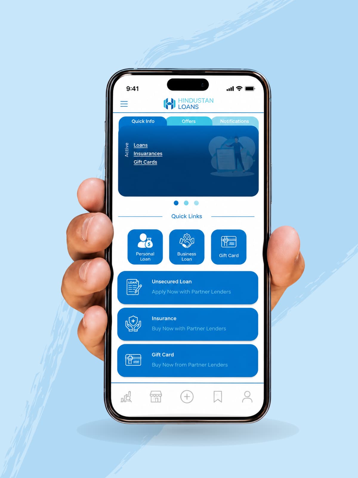
Instant Loan & Lending App for iOS & Android

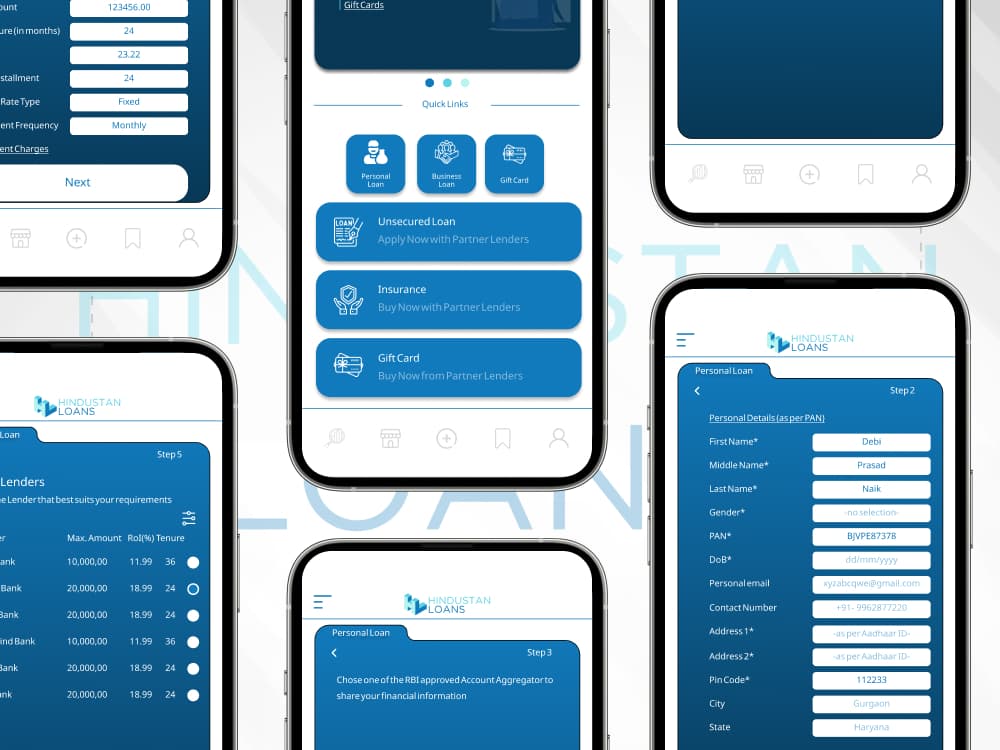
A personal loan app built on the ONDC lending network, letting one guided application search, compare and confirm offers across multiple lender partners, with RBI-approved Account Aggregator consent replacing manual document uploads.

Outcome & Context
Hindustan Loan was built pixel-perfect from Figma into Flutter: multi-step loan forms with live validation, dark and light themes, working on 3G networks across India. It holds a 4.7-star rating across 50,000+ Play Store reviews.
FlutterONDC / Beckn ProtocolAccount Aggregator

He has delivered a pixel-perfect output… clearly gifted at what he does.

Upwork client, Footify

Your iOS app now looks older than it is

Apple changed how every iPhone app looks.

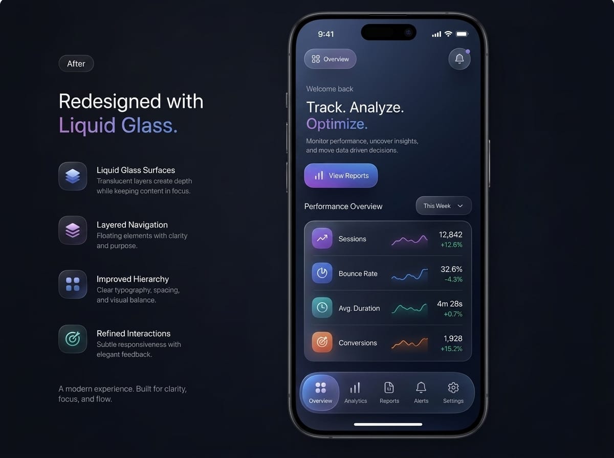
Since 28 April 2026, any app uploaded to the App Store must be built with Xcode 26 and the iOS 26 SDK. That means it renders in Apple’s new Liquid Glass design by default: translucent materials, tab bars that shrink as you scroll, and app icons that have to be rebuilt in layers.

There is a temporary setting that switches the old look back on. Apple has confirmed it is supported for this Xcode cycle only and will be removed in the next major release.

And 79% of all iPhones already run iOS 26, 86% of iPhones sold in the last four years.

28 Apr 2026

iOS 26 SDK required for every upload

79%

of all iPhones already run iOS 26

Next release

the old-look setting disappears

Before
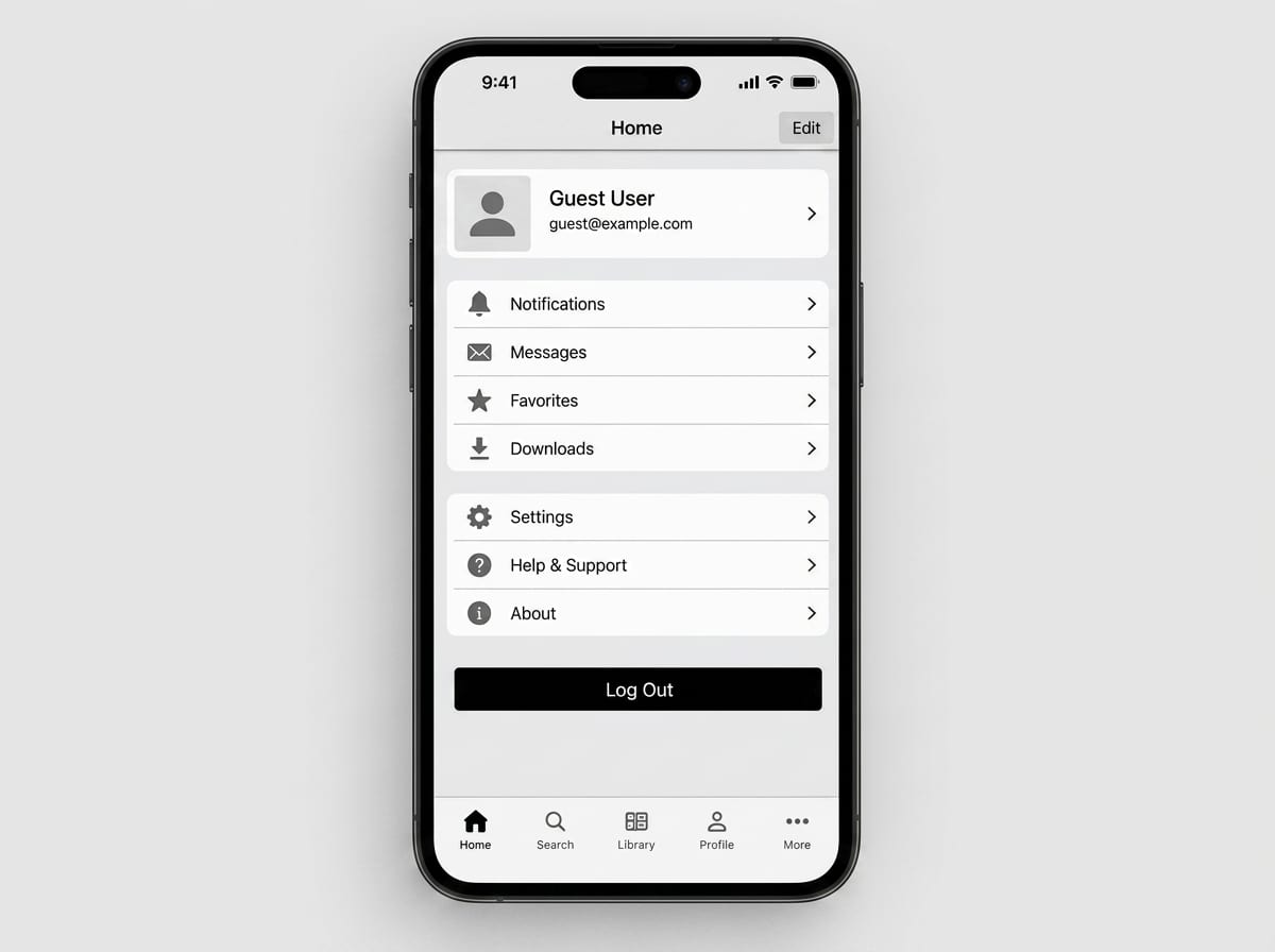
Before screenshot of legacy iOS app interface
After
After screenshot of redesigned iOS app interface with Liquid Glass

So an app still on the old visual language does not look dated next year. It looks dated to four out of five of your users today.

What we do about it: we redesign for the new design language in stages, starting with the screens your users actually spend time on, so you are not paying for a rebuild you did not plan.

Designing for the hand

A phone screen is a thumb, not a mouse

Reach, tap size, one handed use, and what the screen does on a slow connection. Those are design decisions rather than engineering ones, and they are what the sections below cover.

Hands sketching a wireframe onto a tablet

Designing for AI features

This is the part most design teams have not caught up with yet.

The moment an app has an assistant or an agent in it, the old design rules stop working. You are no longer designing software that always gives the same answer. You are designing something that takes time, is sometimes unsure, and is sometimes wrong. That needs its own design work:

While the AI is thinking

Waiting has to feel like progress, not a frozen screen.

When the AI is not sure

The interface should say so honestly. A confident wrong answer costs you the user's trust permanently.

Before an agent acts

If the app is about to book, pay, send or change something, the user needs a clear moment to approve it.

When the AI fails

Timeouts and errors happen. The app should degrade gracefully and stay useful, never break.

Handing over to a human

When the AI cannot help, the path to a real person has to be obvious.

There is no ready-made template for any of this. It is design work, and we do it.

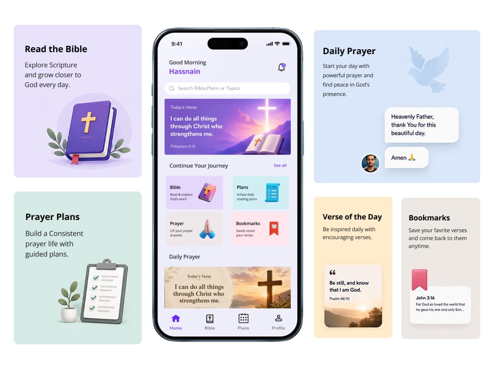
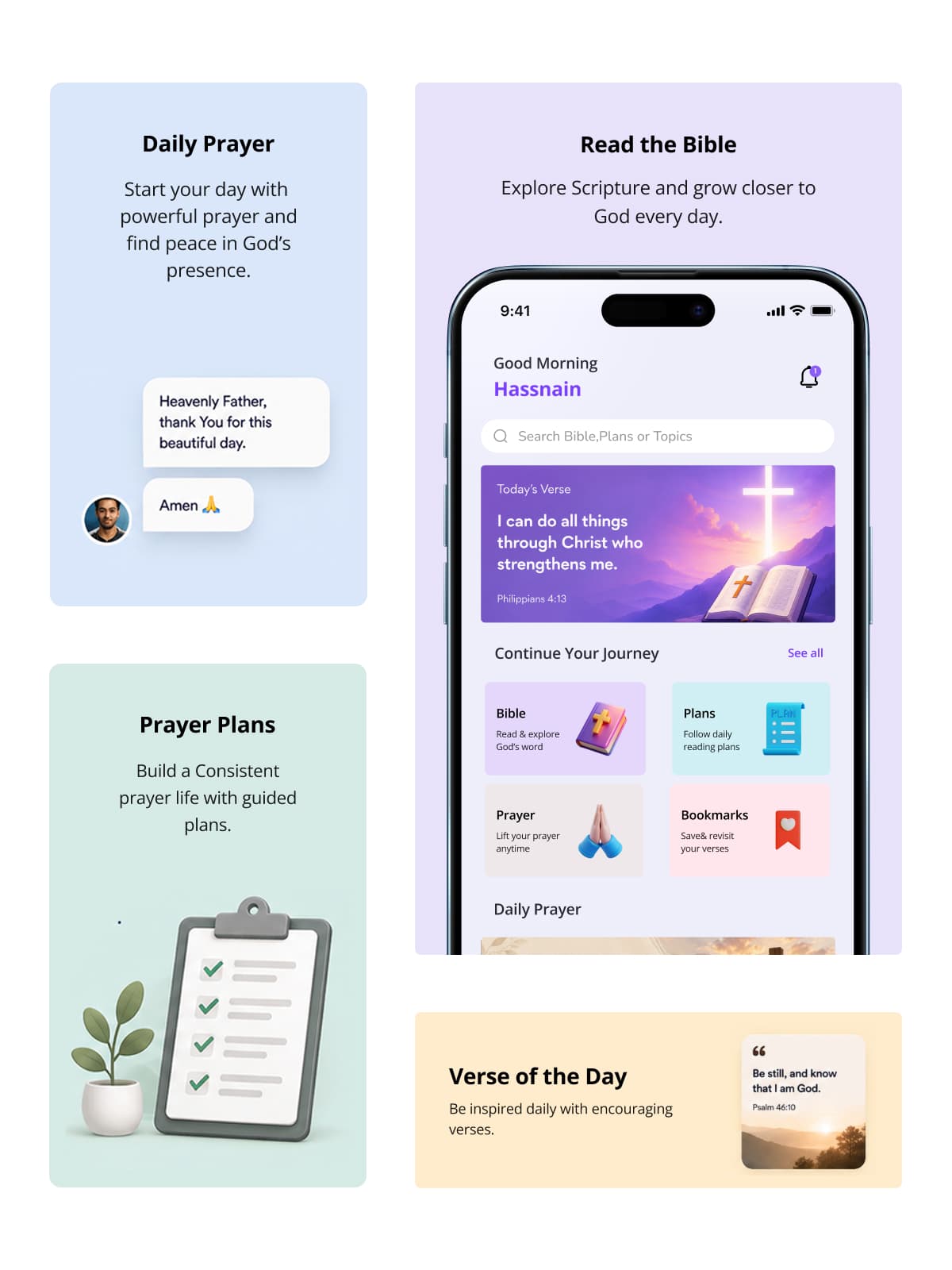
AI-Powered Prayer & Bible App for iOS, Android & Web
FaithTech·Media & Consumer·praythe.bible↗

AI-Powered Prayer & Bible App for iOS, Android & Web

A full native-to-Flutter rewrite of a Christian prayer app pairing AI-generated, Scripture-fused prayers with a validated spiritual wellbeing tracker, 7,464 prayer topics and 550,000+ verse mappings, shipped for iOS, Android and web.

Outcome & Context
Pray the Biblegenerates personalised prayers and matches Scripture to a user’s mood, an AI product where the waiting, the uncertainty and the failure states are the experience. It runs on iOS, Android and web from one Flutter codebase, has passed 500,000 downloads with a 4.7+ store rating, and converts 12% of users to a subscription.
FlutterFirebaseOpenAI

Where we have shipped

Industries we design for

Each item below lists industry and what we design.
Fintech & Banking
Fintech & BankingWallets, lending, KYC, payments, crypto
Legal-Tech
Legal-TechCase management, court data, auctions
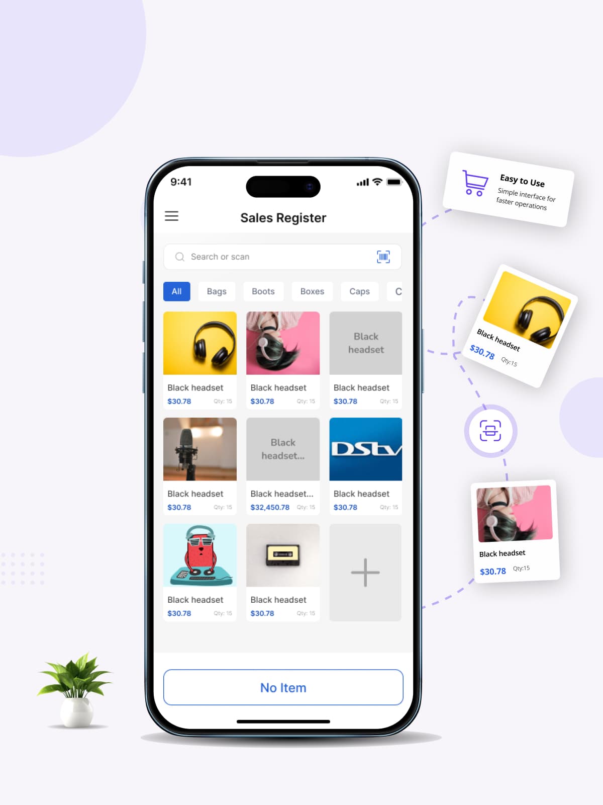
Retail, POS & E-commerce
Retail, POS & E-commerceBilling, inventory, invoicing, POS
Hospitality & Food
Hospitality & FoodDiscovery, booking, reviews, offers
CRM, HR & Internal Tools
CRM, HR & Internal ToolsSales, staff and workflow apps
Energy & Utilities
Energy & UtilitiesSolar, metering, field service
Logistics & Field Operations
Logistics & Field OperationsDriver, warehouse and field-staff tools
Healthcare & Wellness
Healthcare & WellnessPatient apps, telehealth, records, fitness
Real Estate & PropTech
Real Estate & PropTechListings, tours, tenant and broker apps
EdTech & Training
EdTech & TrainingCourses, assessments, AI tutors

Process

How we work

Understand

Your users, your product, what the app has to achieve, and what is already known. If you have analytics or store reviews, we read them first.

2 to 3 days

Flows and structure

How someone moves through the app to get what they came for. Agreed before any screen is drawn, because this is the cheap place to change your mind. You keep the structure.

3 to 5 days

Screens

The visual design, at real device sizes. We use AI to explore more directions quickly, then decide deliberately.

1 to 3 weeks

Prototype and test

Clickable and testable, before a line of code exists. Adjusting a wireframe takes hours. Changing live code takes days or weeks. You keep the prototype.

3 to 5 days

Design system

Components and rules, so the next twenty screens are cheaper than the first twenty. Skipped or shortened if you are building a small first version. You keep the system.

3 to 5 days

Handoff

The developer handoff pack, plus a walkthrough call with your engineers.

2 to 3 days

Together, that is roughly 3 to 6 weeks.

WALL OF PROOF

What clients say once the project is over

The SightInfusion team delivered our app with impressive speed, clear communication, and reliable quality. Every detail was handled thoughtfully, and the final result exceeded expectations. A professional team we're excited to work with again soon.

Dimitri Orga
Dimitri Orga
CEO & Asset Manager, FIDEX DLT

Working with SightInfusion was a smooth and professional experience. The team was proactive, technically strong, and always transparent with updates. Our finance app was delivered on time with great care. We look forward to future projects together.

Debi Prasad Naik
Debi Prasad Naik
CTO, EVOS Solutions Private Limited

SightInfusion handled our complex project with patience, expertise, and consistent communication. Their team learns fast, solves challenges quickly, and delivers dependable results. A skilled, trustworthy team we'll confidently partner with again in the future.

Vishal Pulikottil
Vishal Pulikottil
CEO / Founder, Instinctive Studio

Design tools we use

Design and prototyping
Figma

Flows, wireframes, UI, clickable prototypes, design systems

Handoff

Annotated specs and exported assets your developers can use without a paid seat

Motion
Lottie

Animations that ship to both platforms from one file

Standards
Apple Human Interface GuidelinesGoogle Material Design
AI

Used to explore directions quickly, never to decide

Questions buyers actually ask

Can you design without building it?

Yes, and it is a normal way to hire us. You get the full package, you own the files, and your team or another agency builds it.

Should I hire a designer or a developer first?

For mobile, design first, but only as much design as the stage deserves. A first version testing whether anyone wants the product needs flows and a few key screens, not a full system. A product with real users needs the whole thing. We will tell you which one you are.

How long does app design take?

A first version takes 1 to 2 weeks. A full product takes 3 to 6 weeks depending on screen count. A redesign of a live app takes 2 to 4 weeks and can be staged so you ship in parts.

Do we own the Figma files?

Yes. The editable source files, not just exported images. Everything transfers to you.

What if we do not like the first concepts?

Revision rounds are written into the quote before we start, so you know what is included and what happens after that.

Will our developers actually be able to build it?

This is the question we take most seriously. Every state, spacing rules, named tokens, assets at every density, and a walkthrough call with your engineers before the build starts.

What is the difference between UI and UX?

UX is whether someone can get what they came for. UI is what it looks like while they do. A beautiful app nobody can navigate fails; a plain app that works quietly succeeds. We do both, and we do them in that order.

Do we really need a design system?

Often not yet. If you are testing whether anyone wants the product, a full design system is money spent too early. A short set of rules is enough. Once the product is proven and features keep arriving, the system is what stops it drifting.

Our app is live and users drop off. Do we start here?

Probably not. Start with a UI/UX Audit. You get a written report on what is actually costing you users, ranked by impact, before anyone talks about new screens. Then redesign what the report says matters.

Can you redesign our app without breaking it for existing users?

Yes, and this is usually the right way. We stage it: the screens people spend the most time on first, so you ship improvements gradually instead of surprising your users with a new app one morning.

How do you know the design works?

We test the clickable prototype with real users before development, and we agree up front which number the design is supposed to move: signups, completion, retention, store rating. A design that cannot be judged is a decoration.

Can't AI just generate the screens?

Partly, and we use those tools. But the current generation of tools cannot build from your design system, and their own makers do not claim the output is production-ready or accessible. See designing for AI features.

How much of our time will this take?

A kickoff call, one review call a week, and a decision-maker who can actually decide. Design projects stall on approvals far more often than on design.

Who will actually work on our project?

Anand is on the call and makes the technical calls. The team grows with the project. Accountability does not move.


Have something in mind

Tell us the problem. We bring the engineering.

A short call, an honest answer on whether we are the right team, and a scope you can hold us to.

Start a project